

 Digitalness
 22 August 2024
In today’s mobile-centric world, where smartphones are integral to daily life, the importance of responsive web design cannot be overstated. With more than half of global web traffic originating from mobile devices, businesses must prioritize delivering a seamless user experience across all screen sizes. At Digitalness, we understand that responsive web design (RWD) is the cornerstone of a successful digital presence. It ensures that websites not only look good but also function optimally on smartphones, tablets, laptops, and desktops, driving engagement and conversions.
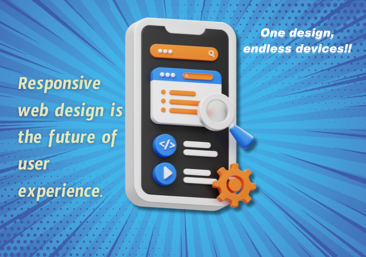
What is Responsive Web Design?
Responsive web design is a web development approach that enables a website to adapt fluidly to various screen sizes and orientations. It utilizes flexible grids, layouts, images, and CSS media queries to adjust content and design elements based on the user’s device. The primary goal is to provide an optimal viewing experience, whether users are accessing your site on a 4-inch smartphone or a 27-inch desktop monitor.
Why Responsive Web Design is Crucial in the Mobile Age
1. Enhanced User Experience
User experience (UX) is a critical determinant of a website’s success. A responsive design ensures that visitors can easily navigate and interact with your website, regardless of the device they’re using. By reducing bounce rates and increasing the time users spend on your site, responsive design leads to higher engagement and conversion rates. At Digitalness, we know that a satisfied user is more likely to become a loyal customer.
2. Improved SEO Performance
Search engines like Google prioritize mobile-friendly websites in their rankings. Since the introduction of Google’s mobile-first indexing in 2015, the mobile version of content has become the primary basis for indexing and ranking. A responsive design ensures that your website meets Google’s mobile-friendliness criteria, thereby enhancing your chances of ranking higher in search results. This is essential for businesses looking to boost their online visibility and attract more organic traffic.
3. Cost-Effective Maintenance
Maintaining separate websites for desktop and mobile users can be both costly and time-consuming. Responsive design eliminates the need for multiple versions of your website, reducing maintenance efforts and costs. With a single, responsive site, any updates or changes only need to be applied once, ensuring consistency across all platforms and streamlining the process. At Digitalness, we advocate for efficient solutions that save our clients time and resources.
4. Increased Reach and Accessibility
With the proliferation of mobile devices, having a responsive website broadens your reach to a wider audience. Whether users are browsing on a smartphone, tablet, or even a smart TV, a responsive design ensures that your content is accessible and user-friendly. This accessibility can lead to increased traffic, improved customer satisfaction, and ultimately, more conversions.
Top Companies Leveraging Responsive Web Design
Several leading companies have successfully embraced responsive web design to enhance their digital presence. Their commitment to RWD is evident in their seamless user experiences across devices.
1. Amazon
As the world’s largest online retailer, Amazon has perfected responsive design to cater to its vast and diverse customer base. Whether you’re shopping on a smartphone or desktop, the website’s design adapts seamlessly, ensuring a smooth shopping experience.
2. Apple
Apple’s website sets the standard for responsive design, providing a consistent user experience across all devices. The site’s clean layout and intuitive navigation remain user-friendly whether accessed on an iPhone, iPad, or Mac.
3. Nike
Nike’s website is another excellent example of responsive web design. The site’s dynamic layout adjusts perfectly to different screen sizes, providing users with an immersive and engaging shopping experience.
4. Starbucks
Starbucks utilizes responsive design to maintain the integrity of its brand experience across devices. The company’s website is designed for easy navigation, ensuring customers can quickly find what they’re looking for, whether on a smartphone or desktop.
5. Airbnb
Airbnb’s website is a prime example of how responsive design can enhance user experience. The platform’s design adjusts seamlessly to different screen sizes, ensuring that users can easily search for and book accommodations whether they’re on a mobile device or a desktop.
Conclusion
In the mobile age, responsive web design is not just a trend; it’s a necessity. It plays a crucial role in enhancing user experience, improving SEO performance, and reducing maintenance costs. By adopting responsive design, businesses can ensure their websites are accessible, user-friendly, and optimized for the ever-growing number of mobile users.
As we continue to navigate the mobile-first era, companies that prioritize responsive web design will be better positioned to meet the evolving needs of their audience, stay competitive, and achieve long-term success. At Digitalness, we’re committed to helping our clients leverage the power of responsive design to drive growth and digital excellence.


